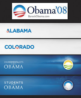
So when it comes to critiquing the landscape of Presidential candidates for 08 I thought I'd check out their respected campaign logo's. NOTE: I am not voting for a candidate based on his or her logo.
I've always found political logo's mystifying. All these candidates want to stand out from the crowd but as you drive by all the supporters on the street corner at a busy traffic light each holding a different candidates sign it's difficult to differentiate them. 99% of these signs are red, white and blue. Typically with a bold font and an American flag. I recall one Election year in Everett a candidate used florescent colors for his campaign. It was refreshing but awful it just didn't work. As much as I would love to see a new political sign it's short of impossible to re-create what we have been trained to visually interpret.
Here's what I found.

John McCain:
Here's an untraditional political Logo. First, there is No red, white or blue palette but I do interpret an American theme. We all know John McCain is a Veteran and this logo further illustrates that with the use of the star. The Army's logo is somewhat similar to his in color and iconography. Not to mention his logo is oddly familiar with the McCain foods logo. Same exact color palette and elements with the star and of course... The same name.
There's something to be said about brand recognition. Aligning yourself with a known entity we all know and love and we associate it with something positive. It's suggestive and smart. Instead of creating your own brand... Borrow one.
In terms of political logo's I like it. It's refreshingly new, well done and clean. I like it because it's symbolic and it communicates. What it communicates to me is John McCain is strong, bold, and a veteran. Through this visual this could be a negative if you are not a supporter of war. Given that I think he is gearing his support towards pro-war, pro-soldiers (who isn't), veteran voters.
I'm not a political advisor or analyst so I'll avoid commenting on a political strategy.

Hillary Clinton:
This to me is a very traditional logo. Red white & blue. Large name in white and an American flag. It's good but traditional. This is the text book political logo. They can crank these simple designs out at Staples. There's nothing to it. The American flag is a wonderful symbol, and it is important for us to maintain it in our society. I like the illustration of the flag. It's a unique flag with 3 stars and 3 stripes.
Why 3?
Odd numbers are good for design and balance. But why 3? Is is just chance?.. Maybe.. Maybe not. What comes in 3's?
The Father the son and the Holy spirit.
They say death's come in 3's.
3 represents "An Alternative". An option that offers an alternative solution.
The Third Reich
The 3 Wise men.
3 branches of our Government.
Luck, especially bad luck, is often said to "come in threes".
3 strikes and you're out.
Three time's a charm.
Now, on the count of three, ready set go!!!
We could go on....
What do you think?
In addition, it is the only logo to use a first name. It's a celebration that she is female and not sharing the name of her husband a former President. And this will communicate strongly to female voters.
Overall it's a well done however a typical logo and doesn't woo me visually.

Barack Obama:
Where do I begin?
This breaks every political logo rule in the handbook. But I think that's the point. The symbolism is abundant in this logo or is it an icon???
This logo much like Google's morphs into what every it needs to be for who ever. It can communicate to the majority or a specific group and to any state. I was impressed when I saw the countless versions of this mark.
The circle could be an "O" for Obama. Or is the "O" the sun setting or rising over a horizon? Are the stripes a flag? Or a meadow? A rolling field? A field of crops? Roads? Does this logo communicate to the urban, suburban and rural populations?
What ever it's doing it does that... Communicates!
What we do know is the circle is the symbol for unity.
I love that this mark is so versatile. As a designer I appreciate the effort placed into making so many versions with so many different color palettes.
It's what a designer wants to work on. Something that will be used and developed into more than just one mark. An extremely well thought out piece.
Well done!
This logo gets my vote. ;)
Scroll back up and vote for your favorite logo on the poll posted on the right.
Go HERE to create your own.


4 comments:
I never thought much about presidential logos until you opened my eyes...now I will pay much more attention...very interesting perspectives on them too from your vantage point as a graphic designer...they make sense.
Thanks Mike.
Nancy
I have long been a fan of the Obama logo.
A follow up: Partisan Politics & Package Design.
http://www.blog.beachpackagingdesign.com/
I love those logos too. So clean. And amazing how it works so well in each of the subcategories, like students, etc.
Anyway, I saw this on nytimes.com, and thought you'd appreciate it. http://campaignstops.blogs.nytimes.com/
2008/04/02/to-the-letter-born/index.html
Post a Comment